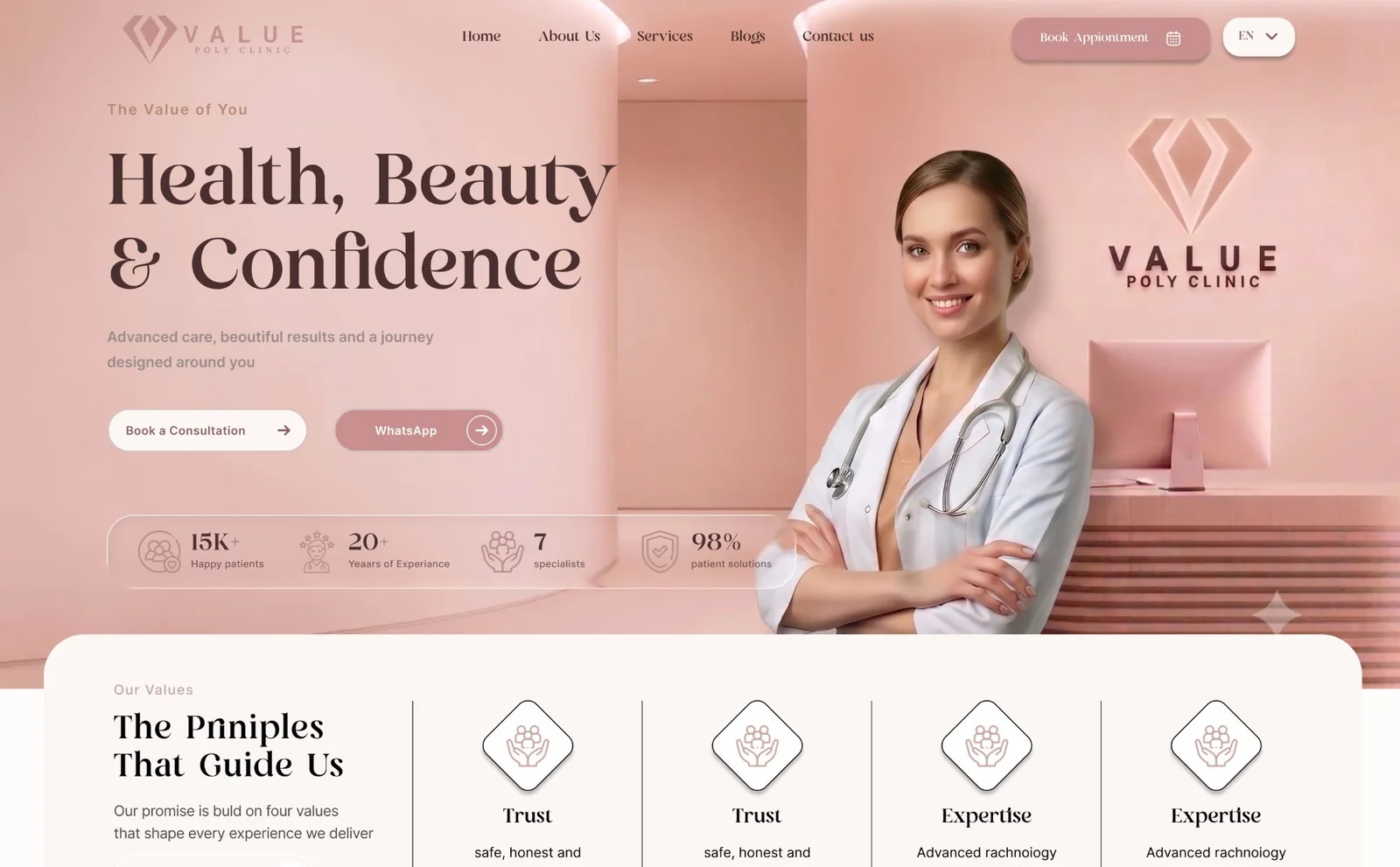
Six specialties, one clinic, and a brand still settling into its name.
Value Poly runs dermatology, men's health, plastic surgery, gynecology, dentistry, and weight loss under a single roof. Each specialty could easily have read as its own mini-business — different tone, different trust signals, different reason to book.
The brand itself was mid-transition: the website and nav said "Value Poly," but the clinic's own interior signage still read "Value Medical Center." Whatever I designed had to carry the newer name forward consistently, everywhere, without waiting for the rest of the business to catch up.
Give every specialty the same shape, so none of them have to compete.
Instead of a specialty-first headline, the hero makes one promise — "Health, Beauty & Confidence" — that any of the six services can sit under. A trust strip (patients served, years of experience, specialists, satisfaction rate) sits directly beneath it, before a visitor has read a single service description.
One promise
A single hero statement instead of six competing pitches, with proof points directly underneath.
Two ways to act
"Book a Consultation" and WhatsApp sit side by side — patients who message before they call aren't a second-class path.
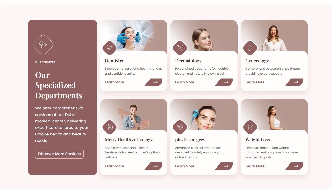
One card, six times
Every specialty uses the same card: icon, name, one line, a way in. The clinic reads as one system, not six.
One palette and one icon language, carried past the homepage.
A blush-to-rose palette runs from the hero through to the footer instead of resetting section to section, and every value and service shares one icon style — a soft line mark inside a rounded diamond, echoing the clinic's own "V" mark. The goal was for "Value Poly" to feel like the name on the door, not just the name in the header.
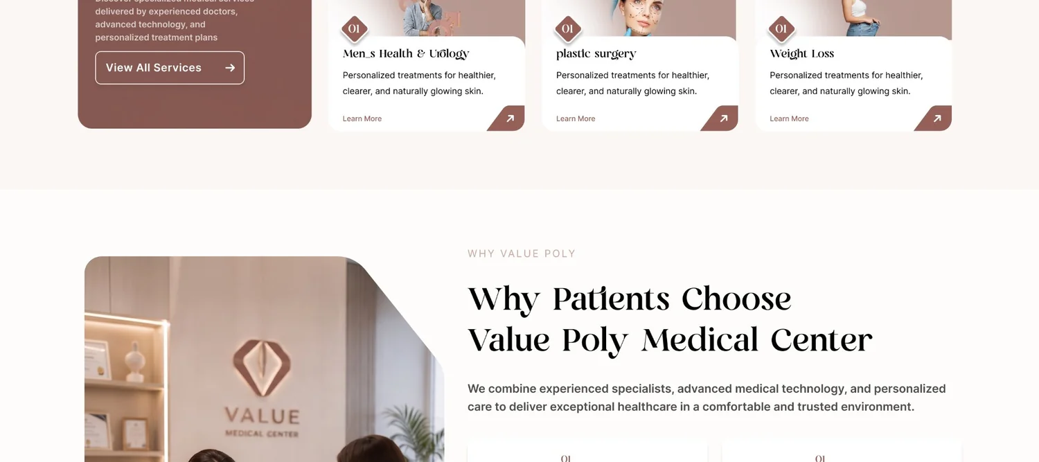
The palette stays warm and muted on purpose — dusty rose and tan read as spa-like rather than clinical, while the dark plum carries enough weight for headings and buttons to still feel trustworthy, not just pretty.
EN Heading
Playfair Display
EN Body
Poppins
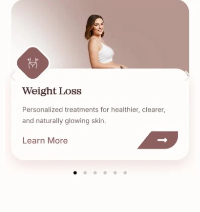
The six specialties become a swipe, not a shrink.
On desktop the six specialties sit in a fixed 2×3 grid next to the intro card, all visible at once. On mobile that grid becomes a swipeable one-card-at-a-time carousel with dot pagination — a deliberate re-think of the browsing pattern for a touch screen, rather than the same grid squeezed into a single narrow column.
Built solo, in WordPress and Elementor Pro.
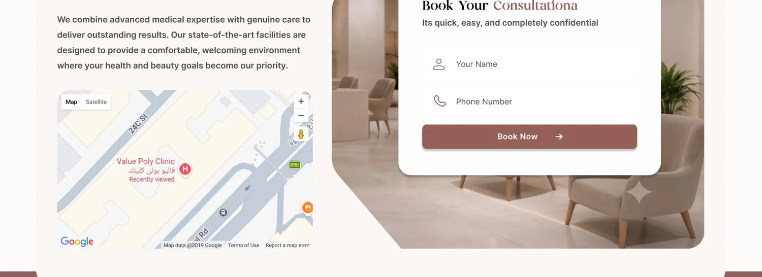
I designed and built this one end to end — no separate frontend hand-off. Each repeating piece (service card, stat tile, testimonial) is a saved Elementor section, so adding a seventh specialty later is a matter of duplicating a row, not redesigning one. The booking module pairs a short two-field form with an embedded map pinned to the clinic, so "where are you" and "can I book now" are answered in the same glance.
A few calls that came from the brief, not the template.
Looking back at it with a UX eye, three decisions do more work than they look like they do:
Copy rewritten per device, not resized
The hero headline isn't the same sentence shrunk down — mobile gets "All in One Trusted Medical Destination," a shorter promise built for a smaller first scroll, while desktop has room for the fuller "Your Trusted Medical & Aesthetic Destination in Dubai."
One diamond mark, three jobs
The clinic's diamond logo mark reappears as the service-card icon frame and again as the trust-section icon shape — the same geometry doing branding, navigation, and credibility signaling instead of three unrelated icon sets.
Proof placed where doubt happens
The Google rating and real, unedited reviews — Arabic included — sit in their own section rather than a generic testimonials slot, right before the booking form, at the exact point a visitor is deciding whether to trust the clinic enough to hand over their number.
Content is the part that never really finishes.
With the structure in place, what's left is the ongoing part: giving each of the six specialties its own description instead of a shared placeholder line, and rotating in real patient testimonials as they come in rather than reusing one or two. The system is built to take that content as it arrives — it just hasn't all arrived yet.
One identity, from the hero to the booking form.
A visitor can land on any of the six specialties and find the same promise, the same trust signals, and the same two ways to act — book or WhatsApp — without the clinic ever feeling like six different businesses sharing a domain.